The History of Hermès Orange


No matter what color is truly your favorite, it's quite likely that no shade quickens your pulse and gives you butterflies as much as the iconic Hermès orange. A single glimpse of the citrus-shaded box sets hearts aflutter.
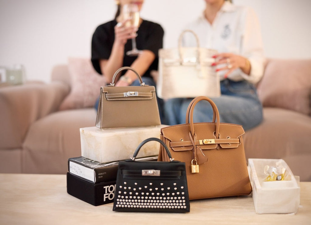
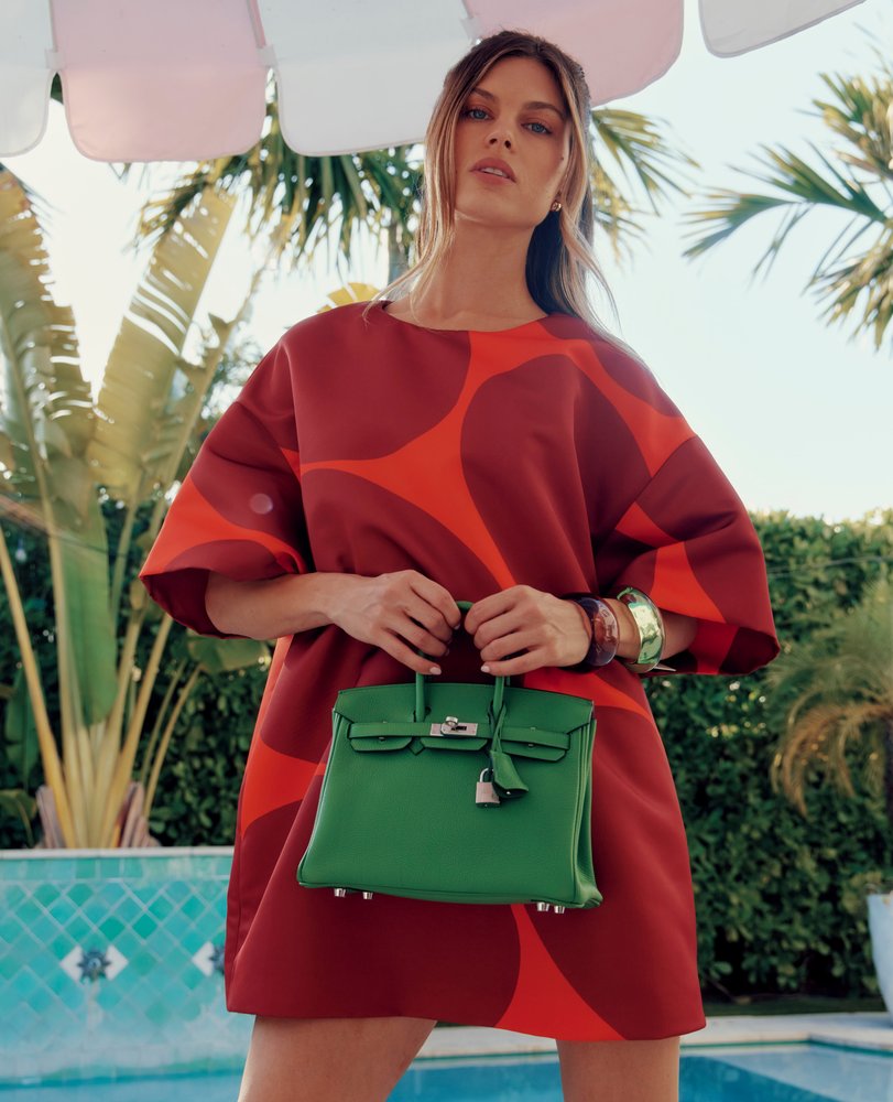
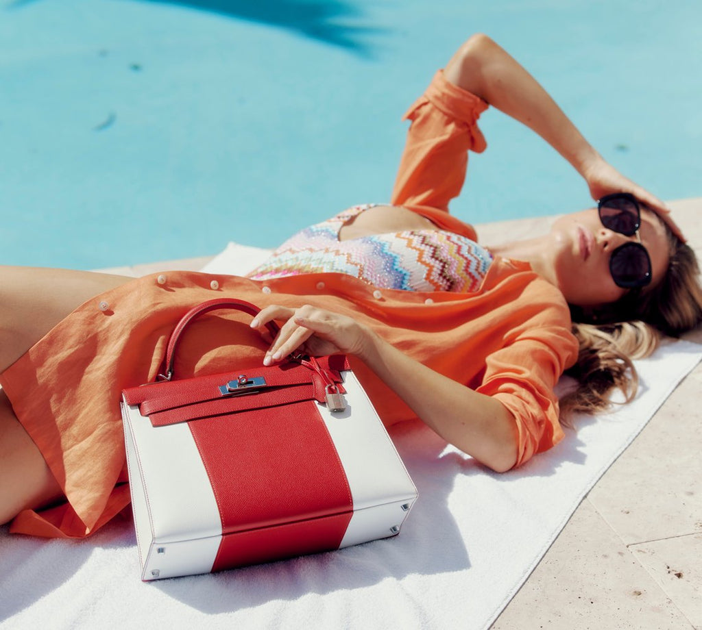
The clear and joyful shade of orange is found in Hermès orange bags like the Birkin and Kelly bags, of course. Still, it is most closely associated with the celebrated box. The signature orange is so deeply entwined with the luxury design house in the hearts and minds of collectors, that it’s difficult to believe that the brand’s packaging hasn’t always looked the same. Let’s explore the history of the Hermès orange box, and how it came to represent everlasting quality.
1920s to 1940s
When World War II began in 1939, shortages struck Europe. Everything from sugar to silk to steel became terribly scarce and often rationed. The shortages were extensive in war-torn France and seemed to impact every facet of life and business, including the packaging available to the Hermès design house.
In 1942, Nazi-occupied France could no longer source the faux pigskin of Hermès packaging. Paper boxes made from cardboard could still be found, but cream and marigold dyes were no longer available. The only color the supplier could provide turned out to be a bold orange. The Hermès orange box was born from hardship and necessity and grew to become quickly recognized as a symbol of ultra-luxury worldwide.
History of the Classic Hermès Orange Box
The Hermès orange hue is Hermès’ signature orange, simply known as Orange, Orange H, or Classic Orange within the brand. In the extensive portfolio of Hermès colors, it is color code 93. The shade is bright and clear, filled with energy and verve. This classic hue is not to be confused with Potiron, which is a darker shade spiced with brown undertones. There is no Pantone equivalent to Hermès orange.
In 1949, the dark chocolate Bolduc ribbon was added to the Hermès orange boxes, adding the perfect finishing touch when delivering the design house’s luxury leather goods. In 1994, the Hermès orange box won the prestigious packaging Oscar award. Until 1996, other products, like Hermès jewelry and tableware, came in different colored packaging — grey for jewelry and green for the tableware. Today, everything the design house offers, from luxury Hermès bags to silk scarves, come in the iconic orange box.
The Hermès orange box history did not end with visible changes made to the packaging. Today, the packaging is made entirely from eco-friendly raw materials, including pollution-free, water-based ink. The cardboard boxes are crafted from 100% recycled materials. And the tissue paper that lines the boxes is made solely from sustainably-managed forests, and earns the Forest Stewardship Council (FSC) certification.
Fun fact: Today, there are about 188 different sizes of Hermès orange boxes, from little ones holding Twillys to larger ones for Birkin 40s and beyond.
The Psychology of Hermès Orange Color
The color orange combines the strength and passion of red with the sunny cheer and optimism of yellow. Hermès orange is the color of adventure and communication, of self-confidence and enthusiasm. In the psychology of color, bright orange has rejuvenating characteristics and signifies shelter from grief and disappointment. Because of its close association with red, orange conveys meanings of joy, warmth, heat, sunshine.
In some European cultures, orange symbolizes royalty. In Central and South Asia, it is seen as a spiritual color. In China and Japan, orange is associated with prosperity and good health. And, of course, for fashionable women worldwide, Hermès orange is an enduring symbol of impeccable style, exquisite quality, and often boundless joy.
It is said that if orange is your favorite color, you’re a force to be reckoned with, highly social, and easy to talk to. Orange is an uplifting and confident color, so this could be the reason our heart skips a beat when we see those iconic Hermès orange boxes! That and the fact we can’t wait to see what’s inside!
 For our #hermesunboxing this week: our Kelly “Lettre S” Sellier 28cm in Gold epsom, Celeste chèvre mysore and Blue Sapphire clemence. It was first seen on the Resort 2018 runway. What does everyone think?
  Personally we’re obsessed!
Why is the Hermès Logo Orange?
The Hermès logo is based on the painting “Le Duc attelé” by Alfred de Dreux. It depicts the stylish horse-drawn carriage with the waiting groom. The logo pays homage to the design house’s origin as the premier saddler and harness made for French nobility. The Hermès orange logo is typically depicted in dark chocolate brown with the bright orange of the box shining through or in the same orange against a field of white.
Hermès artisans have a richly-deserved reputation for an extraordinary way with color. Hermès bag colors encompass a kaleidoscope of colors with exceptional range and depth. So, why would Hermès, synonymous with luxury and with a world of colors to choose from, choose an orange logo?
The orange Hermès logo is not a complex shade blending with peaches, coral, or salmon. Instead, it is the same bright, bold color they used in WWII. Surely it is a nod to the indomitable European spirit that survived cataclysm and war to emerge defiant and optimistic once again.
Shop authentic, store-fresh Hermès handbags and accessories at Madison Avenue Couture, and keep collecting those Hermès orange boxes!
Recent Articles